Ranking Of All Modern Doctor Who TARDIS Designs. Where Does Ncuti Gatwa's Stand?

Do you agree with the top 3?
This may be up for debate, but it seems like with his return, Russell T Davies propelled Doctor Who to an entirely new era. The 60th anniversary specials introduced us to Disney ’s bigger budgets, the wonders of bi-generation, which lets two new Time Lords live side-by-side in the same time period, and, of course, the revamped TARDIS design.
New Doctor New Design
Ncuti Gatwa's Fifteenth Doctor essentially inherited the interior of the TARDIS from the previous incarnation played by David Tennant, when the characters used the Toymaker's powers, which defy all laws of physics and logic, to clone the ship.
The Fifteenth has already traveled in his new ship in the Christmas special, and even introduced his first companion, Millie Gibson's Ruby Sunday, to it. Clearly, the duo and their future co-travelers will have many more adventures in the new TARDIS for years to come, starting on May 11 when two new episodes air on BBC One and Disney+.
But is the newest the best? How does the spaceship of Ncuti Gatwa's incarnation compare to other modern designs? To answer that, we need to dive right into ranking mode. Let's see if you agree with our top and commentary.
7. The War Doctor

Like many fans, we place the War Doctor's design last. Introduced in Season 7, John Hurt's Time Lord didn't appear much in the show, which might explain why his TARDIS design didn't quite win over viewers.
Functional as it is, the spaceship feels a little lacking with its classic white polka-dot walls. The console and coral frames add charm, but they are too reminiscent of the Ninth/Tenth design. And that step under the console? It seems more of a hazard than anything practical, leaving fans scratching their heads over its inclusion.
6. The Thirteenth Doctor
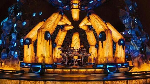
Jodie Whittaker and Chris Chibnall's tenure brought significant changes to the Doctor's aesthetic, especially the TARDIS. Her spacecraft definitely stands out among the rest as the most creative. With its yellow and blue crystal motif, it's a refreshing departure for Doctor Who, but a bit cliché for an alien sci-fi theme.
Besides, the overall atmosphere feels excessively dim. Even the Doctor herself doesn't frequent the space much, preferring to hang out outside.
5. The Eleventh Doctor (2nd Design)
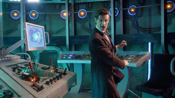
Matt Smith stands out as the only incarnation to sport two TARDIS designs during his time as Doctor Who. The second iteration arrived in the middle of Season 7, in the post-Pond era.
Reflecting the Doctor's grief at the loss of his cherished companions, this design feels a somewhat devoid of personality - cold, empty and unwelcoming. However, its layout is impeccably executed, setting a gold standard for all future TARDIS interiors.
4. The Twelfth Doctor

Peter Capaldi's era introduces a TARDIS with the same fantastic layout as the Eleventh's second design. To complete the picture, it is given personality through decor, furniture and cozy lighting.
However, the steam-punk vibes are not to everyone's taste. While this interior perfectly complements the Twelfth Doctor's persona and has been the top choice in many viewer polls, it has also been criticized for its dark-ish color scheme.
3. The Fourteenth/Fifteenth Doctor
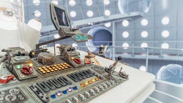
Behold, the new TARDIS design introduced in the anniversary specials. Since Ncuti Gatwa's and David Tennant's ships differ only by one jukebox-shaped detail, we count it as one and place it in our top 3 picks for modern era interiors. It's undeniably the most spacious of the bunch, truly embodying the 'bigger on the inside' miracle and giving both Doctors ample room for their frantic button-pushing and lever-pulling antics.
With its sleek, futuristic vibe, adorned with illuminated roundels reminiscent of classic interiors, it's a delightful blend of old and new. There's also a coffee maker, an unexpected but charming addition. However, the stark white and gray palette makes it feel a bit empty and overly bright. The disco-esque color changes, while novel, can be disorienting and occasionally give the feeling of entering a sci-fi dance party.
2. The Ninth/Tenth Doctor
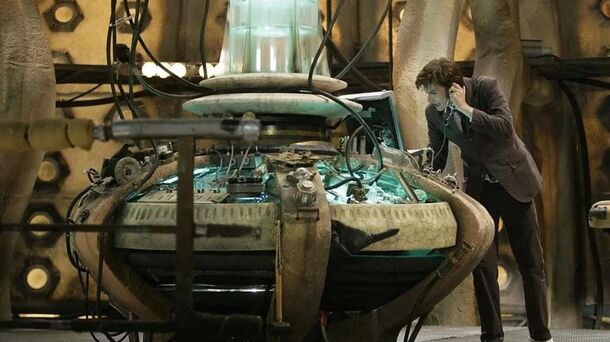
David Tennant seamlessly carried on Christopher Eccleston's TARDIS interior during his first stint as Doctor Who. For many Whovians, this iconic interior defines the modern era and remains THE ONE.
Despite the occasional clutter in the console room, the spaceship exuded warmth and charm with its distinctive coral frames and enchantingly earthy aesthetic. Perhaps its only downside was the lack of cozy, homey touches.
1. The Eleventh Doctor (1st Design)
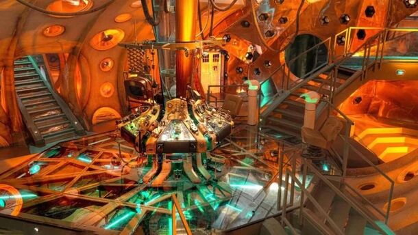
Picking a favorite TARDIS interior is no easy task, but this one really stands out. Matt Smith's original design seamlessly blends the creative flair and nostalgic charm of its predecessor with the whimsical tiered layout of its successor.
With multiple staircases, corridors, glass panels, and an array of buttons and roundels, the interior exudes a soul-stirring blend of steam-punk and fairy-tale aesthetics. It's reminiscent of stepping into Willy Wonka 's factory or venturing down the rabbit hole in Alice in Wonderland - a delightful mishmash of imagination and adventure.